GPS
For this project, I designed GPS, a centralized information and tracking platform built for Cargill to enhance visibility and coordination across its network of suppliers and farmer clients. The system was designed to streamline how teams monitor contracts, payments, and logistical movements throughout the entire journey between agricultural producers, intermediaries, and Cargill’s operations.
TMS
Cargill
2026
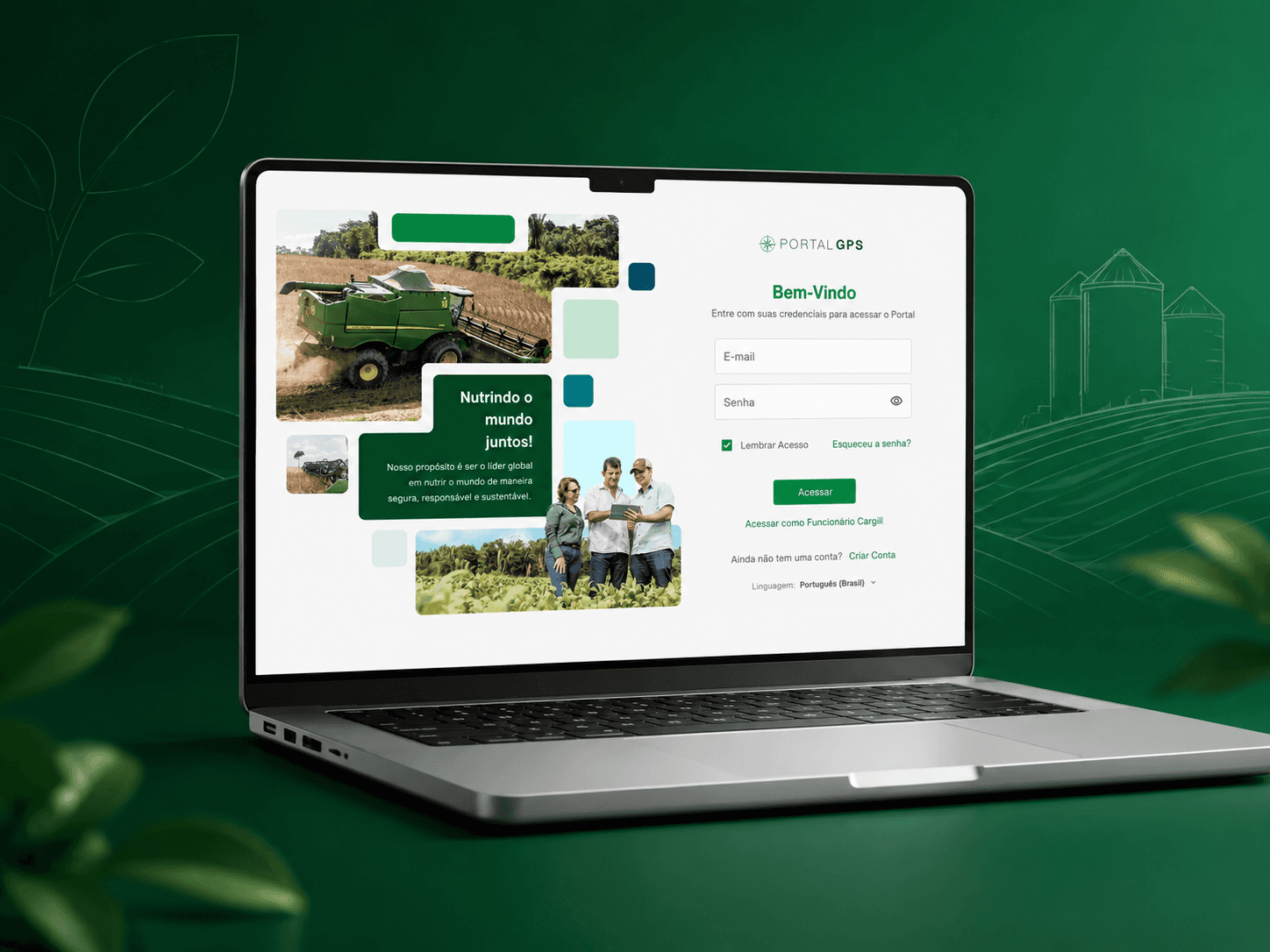
Modernizing a Legacy Platform
GPS had been in the market for over a decade, serving as a key platform connecting agricultural producers with trading companies and intermediaries throughout the commodity supply chain. Despite its business relevance, the product had gradually become outdated, accumulating technical and design debt that limited its ability to evolve and respond to changing user needs.
At the time I joined the project, product development relied on an external offshore team, resulting in long delivery cycles that often took months to implement new features or improvements. This significantly reduced the team's ability to validate ideas, respond to market demands, and continuously improve the user experience.
To address these challenges, the company initiated a complete product modernization initiative. My role was to help redefine the product experience from the ground up by introducing a user-centered design process supported by discovery research, product analytics, usability testing, and continuous user feedback.
At the time I joined, however, the platform had no analytics infrastructure in place, and there was no way to measure user behavior, adoption, or friction points. Building this measurement foundation became part of the scope, allowing the team to move from assumption-based decisions to evidence-based ones for the first time.
Alongside the redesign of the platform, I led the creation of a scalable Design System that established a shared design language across the product, accelerated collaboration between Design and Engineering, and enabled faster, more consistent product development.
This transformation shifted GPS from a slow-moving legacy application into a modern digital platform built around data-driven decision making, scalable design practices, and a significantly improved experience for both producers and commercial partners.


Redefining the Information Architecture
Following the discovery phase which included user research, stakeholder interviews, personas, journey mapping, and analytics, it became clear that many of the platform's usability issues originated from its information architecture rather than the interface itself.
One of the first initiatives was to redesign the application's navigation model around the way users actually work. Instead of requiring users to repeatedly search for the same producer, harvest season, or contract every time they accessed a different module, the platform introduced a persistent contextual header. Once a customer was selected, users could seamlessly navigate across the application while maintaining the same context, dramatically reducing repetitive actions and cognitive load.
The new architecture was organized around five core pillars that reflected the users' daily workflows:
Contracts - Centralized access to contract details, pricing, quantities, and commercial information.
Commodity Operations — Complete visibility into deliveries, inventory movements, and logistics throughout the supply chain.
Payments — Financial information, settlements, invoices, and payment status in a single location.
Documents & Attachments — A centralized repository for contracts, certificates, invoices, and supporting documentation.
Administration — A dedicated workspace for managing user accounts, permissions, service providers, notifications, and personal settings.
This new structure transformed the platform from a collection of disconnected modules into a cohesive product ecosystem. By organizing information around user goals instead of internal system architecture, navigation became significantly more intuitive, operational efficiency increased, and users were able to complete complex tasks with fewer interactions and greater confidence.


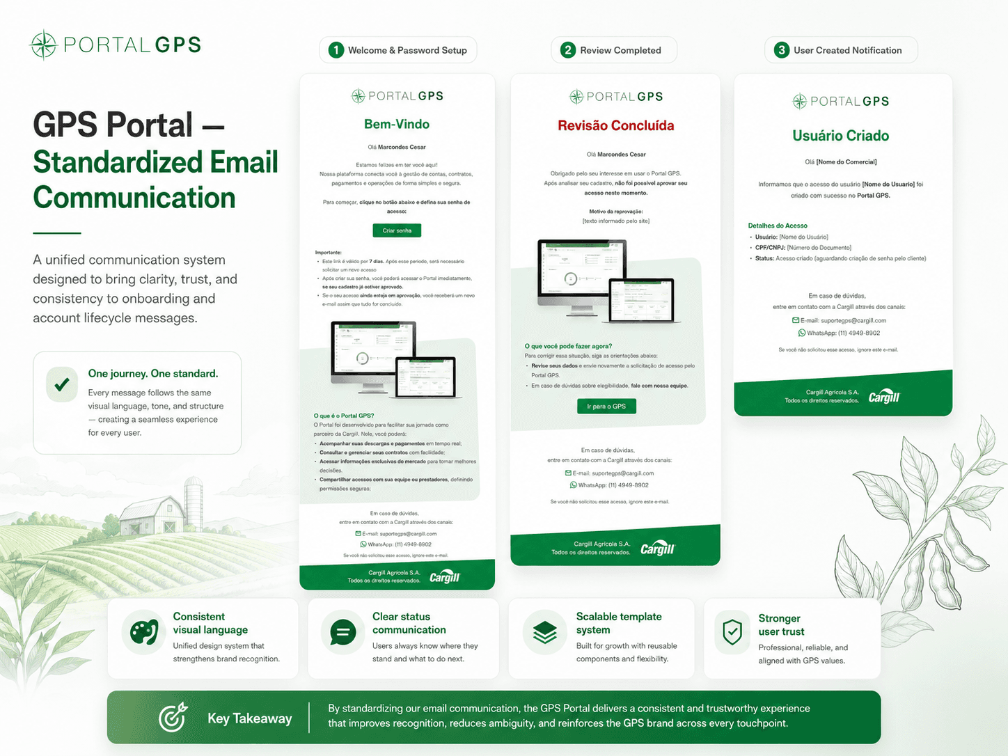

UX Strategy and Continuous Improvement
For GPS, the UX strategy was designed as a continuous product practice rather than a one-time redesign effort. Because the platform supports a complex B2B ecosystem involving producers, merchants, service providers, contracts, deliveries, payments, and documents, it was essential to combine qualitative research, product analytics, usability testing, and stakeholder alignment into a single operating model.
The first step was to define critical journeys for each user profile and establish measurable indicators for the most important workflows, such as finding a contract, creating a dispatch order, checking payment status, downloading documents, and managing user access. Each journey was evaluated through task success, completion time, error rates, user feedback, support tickets, and product usage data.
To support data-driven decisions, I proposed an analytics structure capable of tracking key events across the platform, including customer selection, contract search, filter usage, document downloads, dispatch creation, payment visualization, error messages, and report exports. These events would allow the team to identify friction points by user type, country, module, and workflow.
In parallel, recurring usability tests and research sessions with farmers, merchants, and service providers helped validate assumptions and uncover operational pain points that were not visible through analytics alone. This created a stronger feedback loop between users, product teams, engineering, and international stakeholders.
The Design System also became part of the UX governance strategy, ensuring that tables, filters, forms, alerts, validation messages, accessibility standards, and navigation patterns remained consistent across modules and countries.
Together, these practices created a sustainable UX model focused on reducing friction, improving operational efficiency, increasing trust in the platform, and helping GPS evolve based on real user behavior instead of assumptions.


